Saturday, September 29, 2007
Wednesday, September 26, 2007

What is packaging for? Generally, its just something to hold a product. but that's the usual answer, not the innovative one.
Creating objects that are themselves stackable to form an attractive display.
The Idea arises from the observation that when the levels are stacked up by the Involoved , the spines reveal various colors and patterns, different in each individual case but adding them up together a fresh look.
Minimal identification graphics using these limited geometric elements in a combination,
The infinite array of forms, colors, texture and pattern in a range of combination
Sunday, September 23, 2007
Thursday, September 20, 2007
section in progress.
click to enlarge
 My last post was on the 14 th, I wish I could post new post every day.
when I feel tired from working on the Dartmouth section I work on the axonometric for the baby born, I think it would reveal the Interior and its relationships among the diffrent volumes. it will be my next post and hopefully in addition to the new section of Dartmouth street.
 My last post was on the 14 th, I wish I could post new post every day.
 However lets say its not about quantity, its about quality.
This post to say, I am on the case.
Its for the section with the interior spaces resolved.
Its for the section with the interior spaces resolved.
Ted, is the section now gives the sence of the interior space? or not yet?
I am struggling with the other section of Dartmouth street.
when I feel tired from working on the Dartmouth section I work on the axonometric for the baby born, I think it would reveal the Interior and its relationships among the diffrent volumes. it will be my next post and hopefully in addition to the new section of Dartmouth street.
all best.
Amr
Friday, September 14, 2007


 Guiding the way!
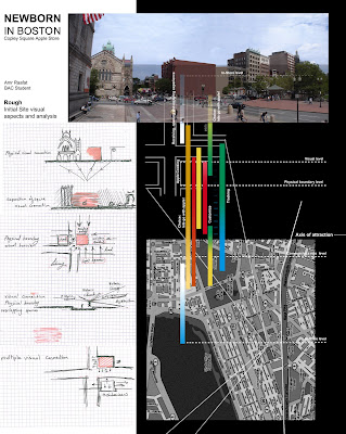
Pinpointing the apple destination with visual prompts
ONLY, the facade Description
Consider the arrows in the plan, the humble symbol is so familiar as a visual sign. its simplicity and utility perfectly illustrate the power to keep on navigate the broad and winding,
Baby born facade design gives a statement about developing effective symbols that slice through visual clutter, about coining a vocabulary of shapes and colors that helps the baby born Navigate and guide the world around him. following the 2 Axis of the site potential customers sources.
Arrows as symbols are ubiquitous and universal.
In Babyborn case, it comes up with a new symbol to devise new icon and facade design direction so effectively and naturally that they seem as familiar and intuitive as an arrow
The babyborn facade's design elements suggest movement and direction as well as generates delight in the public place.
Apple's facade geometery, sign and potentials create a land mark.
Monday, September 10, 2007
Monday, September 3, 2007
Subscribe to:
Posts (Atom)
BAC, Distance March, Design Studio
Apple Store, Boston , MA


